This is something that I have been interested in for as long as I have been involved in Graphic Design and the subject I feel most confident in researching because of my large interest in it.
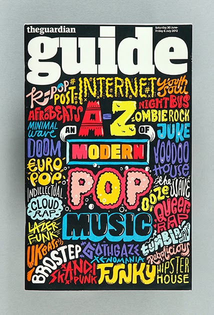
I have found that there are two different types of hand rendered type. Type 1 is typefaces created to look like handwriting or of that which is obvious drawn by hand. Type two is illustrated type, which is usually created specifically for the piece of work created.
Hand rendered typefaces:

Illustrated type:

As a designer, I prefer to look at illustrated type, however when it comes to what I would create myself, it is definitely full typefaces where I feel more comfortable.
I looked into the history of typography & lettering to see the difference between the two and how these two types fit into type history & origins.
Historical Research
What Is “Typography”?
Typography is essentially the study of how letterforms interact on a surface, directly relating to how the type will be set when it eventually goes to press. One definition is stated as “the style, arrangement or appearance of typeset matter,” and is a product of the movable type printing system that much of the world has used for centuries. It is related to typesetting and can include type design.
In our current digitally-driven design world, this means working with fonts on a daily basis for most of us. Typography is actually a subset of lettering, because it is the study of letters applied to typefaces. Many designers have also taken up letterpress printing as a hobby or side interest, which also utilises aspects of typography or typesetting, depending on the project.
What Is “Lettering”?
Lettering can be simply defined as “the art of drawing letters”. A lot goes into making lettering look right, and that’s an entirely different topic, but the concept is very simple: a specific combination of letterforms crafted for a single use and purpose as opposed to using previously designed letters as components, as with typography. Often lettering is hand-drawn, with pens, graphite or brushes, although some people start their work directly in Adobe Illustrator. Engraving and similar arts are related to lettering.
Comparing the two
The arts of both lettering and calligraphy have been around since time immemorial. Spoken languages quickly developed writing systems, which were then used to communicate through a more enduring medium than speech. Lettering and calligraphy evolved alongside each other, along with other letter-related arts such as engraving. We can follow the progression, from the Rosetta Stone and ancient Roman inscriptions to the works of scribal art mentioned above and more.
History has provided us with endless examples of lettering and calligraphy, by engraving, pen and brush.When Johannes Gutenberg built his printing press around 1439, the concept of typography, which had been developing slowly, was revolutionized. The moveable type system, metal alloy and casting methods gave the world a practical solution to printing. This gave rise to the discipline of typography as we know it, with kerning, leading and the terms we still use today. Each letter had its own type block on which it sat, and typesetters would arrange the type character by character.
Lettering and calligraphy followed cultural trends, leaving the Rococo era and becoming more sober during the early 19th century, only to flower into ornament once again through the Victorian era and the florid shapes of Art Nouveau. The worlds of type and lettering constantly intermeshed. Many people, such as Oswald Cooper, achieved respect for their lettering and were hired by type foundries to design new typefaces.
Lettering figured strongly through Art Deco and Modernism, for posters and ads, logotypes and book covers. The relatively recent art of film titles also provides us with a wide range of illustrative lettering styles from the 20th century. Coming out of the Modern era and through the latter half of the 20th century lettering went through a variety of permutations — the organic styles of the 70′s, the new modernism of the 80′s, and the grungy 90′s styles aforementioned — bringing us to our modern lettering scene, with a smorgasbord of visual references to every period of history imaginable. Designers such as Herb Lubalin and Doyald Young, the metaphorical giants of lettering, have left a huge legacy from this time period.
The linotype was just one of the machines used to expedite the typesetting and printing processes, and although some people still hand-set type, the industry as a whole was continuously changing to introduce faster and better techniques. Typography was explored in the various art movements, from Dada to Modernism and beyond, rethinking ways in which type could be used and given expression and meaning. As typography, experimental and traditional, progressed, the techniques segued to phototypesetting and from thence to the digital age in which we find ourselves today. Typography as a discipline looks very different than it did 50 years ago. Lettering has also moved into the digital format in which we enact most of our design work. Many artists, however, stay true to analog media by hand-drawing lettering.
Reference: Smashing magazine
Typeverything
Calligraphica
Typography Infographics

My interest in hand drawn type first started when I found designer Mike Perry. All of his work has such an individual look that I instantly took to it and have been following him ever since. His type work is in illustrated type, and he is constantly exploring hand rendered type.
'In this digital age of computer-generated graphics and typography, it's refreshing to see a small subset of typographers who still believe in working by hand'

Since looking into Mike Perry, I have constantly looked into typographers and particularly ones who create work by hand. This is how I came across Dan Cassaro a few months ago.
I particularly liked Dan Cassaro's design work for Ford. It was used as a part of an ad for the company, which was full of text which was all hand drawn type.Cassaro's contribution:


Ford Fiesta Ad:
Hand drawn type is fast becoming a very in demand piece of design. While the digital technology started to emerge it took a bit of a back seat for the clean and perfect look of digital text, but now all areas of design are looking to incorporate a unique and quirky look that comes with hand rendered design and type.
After looking at the Ford ad, I have decided to go down the route of looking at hand drawn type in advertising and branding as I think this is a current areas of design that I have a large interest and it is a big
NABOB - Hand Drawn Chalk Ad with Jeff Rodgers:
Jeff Rodgers
I came across Jeff Rodgers when I found the ad above, and have found his hand drawn type has a sense of fun and playfulness about it. Rodgers has done a couple of wall murals, and the one that interested me the most was one that he created for McDonalds. This includes the whole process he went through to create this for them.


Painting Process:

Other wall mural work:
Flexfit Installation at PROJECT:
Flexfit Installation at PROJECT:
Ace Hotel Wall Murals:


Si Scott


Letman


Jon Contino


Kate Moross


No comments:
Post a Comment